8.12 Explore the segments
Now that we have isolated 4 customer segments from our existing customers, we shift our attention to a practical problem. If marketers want to use this information to target new customers, they will need description of the customers that they can use to locate these customers. By definition, a new customer has not purchased from you before. Therefore, you don’t have their purchase behavior data. However, if we can correlate customer demographics with the customer segments, then we can help marketers in identifying these segments.
Let’s investigate 3 demographic variables —gender, marital status, and income— within each cluster.
8.12.1 Gender
cluster_data %>%
  mutate(Gender = ifelse(gender == 1, "Male", "Female")) %>%
  group_by(km_cluster, Gender) %>%
  summarise(count = n()) %>%
  ggplot(aes(x = km_cluster, y = count, fill = Gender)) +
   geom_col(position = "dodge", color = "white") +
   scale_fill_brewer(palette = "Set1") +
   labs(y = "Count", x = "Clusters") +
   theme_minimal() +
   theme(legend.position = "top")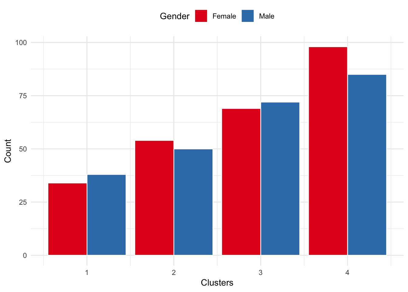
Cluster 1, 3, and 4 have even distributions of males and females. Cluster 2 has a slightly higher concentration of females. However, targeting based on gender alone may not give significant sales.
8.12.2 Marital status
cluster_data %>%
  mutate(Married = ifelse(married == 1,
                          "Married",
                          "Unmarried")) %>%
  group_by(km_cluster, Married) %>%
  summarise(count = n()) %>%
  ggplot(aes(x = km_cluster, y = count, fill = Married)) +
   geom_col(position = "dodge", color = "white") +
   scale_fill_brewer(palette = "Set2") +
   labs(y = "Count", x = "Clusters") +
   theme_minimal() +
   theme(legend.position = "top")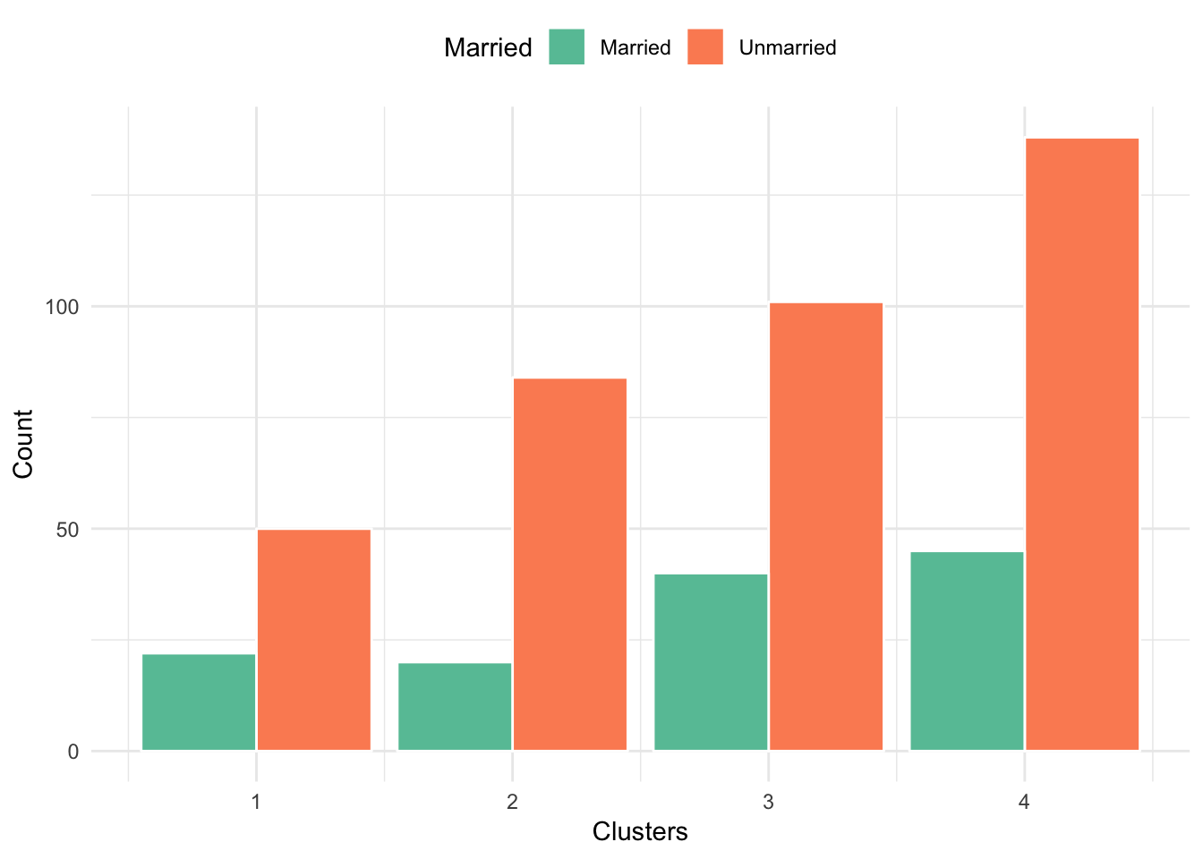
In general, all clusters have higher concentration of unmarried customers compared to married. Thus, marital status is not a good discriminant variable.
8.12.3 Income
cluster_data %>%
  mutate(Income = plyr::mapvalues(
    income,
    from = c(1:6),
    to = c("< $30k", "$30k-$45k","$45k-$60k","$60k-$75k",
           "75k-$90k",">$90k"))) %>%
  group_by(km_cluster, Income) %>%
   mutate(count = n()) %>%
   ggplot(aes(x = km_cluster,
              y = count,
              fill = reorder(Income, income))) +
   geom_col(position = "dodge", color = "#4c566a") +
   scale_fill_brewer("Income group") +
   labs(y = "Count", x = "Clusters") +
   theme_minimal() +
   theme(legend.position = "top")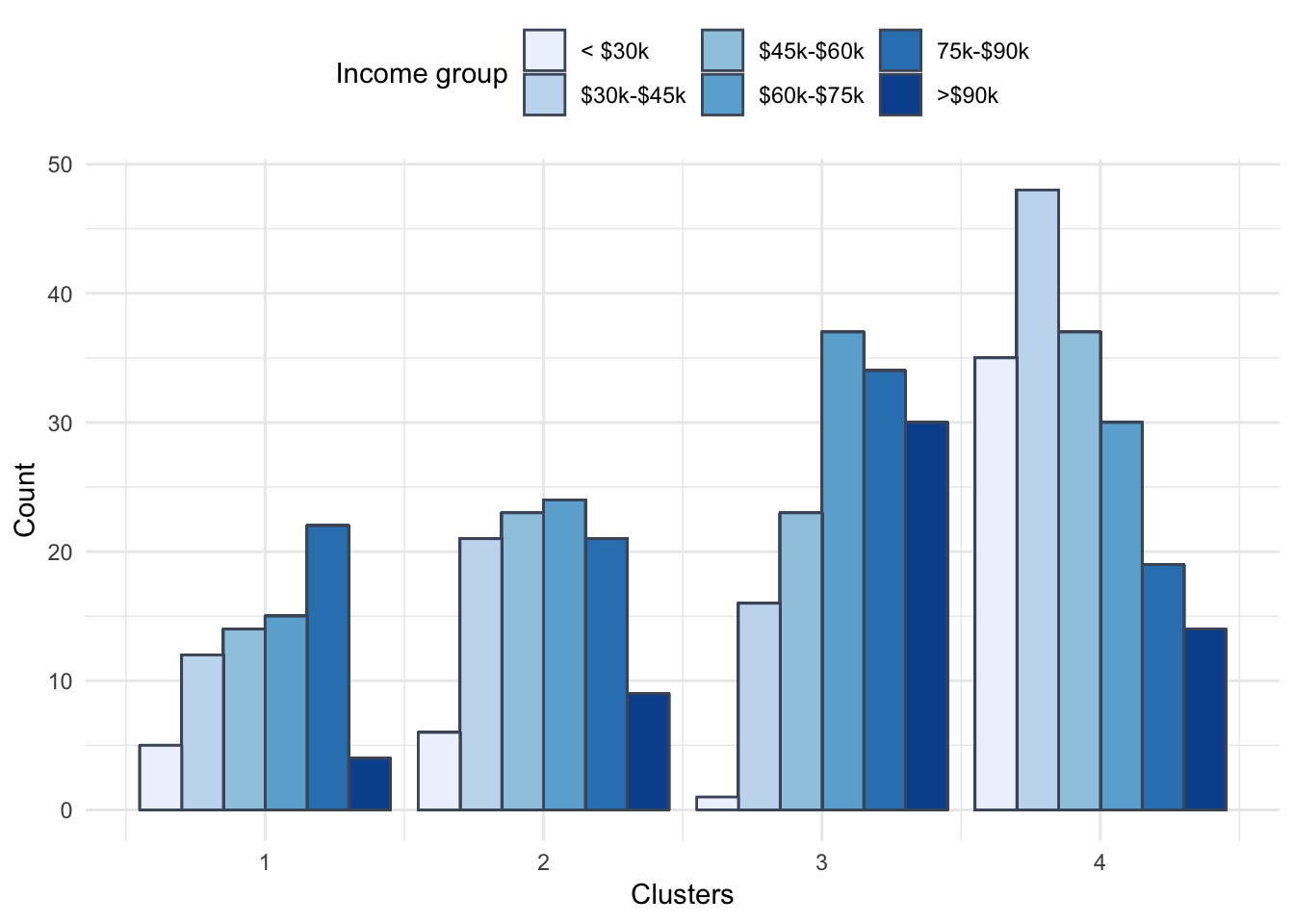
Clearly, income varies a lot between these 4 segments.