8.10 Visualize clusters
The fviz_cluster() function visualizes the cluster in 2 dimensions. However, we have 3 dimensions. fviz_cluster() performs Principle Components Analysis (PCA)47 behind the scenes to reduce the dimensions such that data can be represented by clusters in a 2-D space.
fviz_cluster(object = km_cluster, # kmeans object
             data = cluster_data_pro, # data used for clustering
             ellipse.type = "norm",
             geom = "point",
             palette = "jco",
             main = "",
             ggtheme = theme_minimal())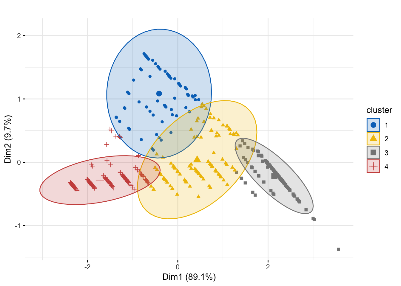
Figure 8.3: Cluster Plot
Figure 8.3 shows that we have really neat clusters with not a lot of overlap.
Although, not possible in all the cases, for our exercise we can also build a 3-D plot because we have only 3 clustering variables. We will use plotly package for making an interactive visualization. The code below, without explanation, shows you how to make an interactive 3-D plot. Interactivity will not work in PDF. The HTML plot is shown in Figure 8.4.
plot_ly(x = cluster_data$recency,
        y = cluster_data$frequency,
        z = cluster_data$monetary_value,
        type = "scatter3d",
        mode = "markers",
        color = as.factor(cluster_data$km_cluster)) %>%
        layout(title = "",
               scene = list(xaxis = list(title = "Recency"),
                            yaxis = list(title = "Frequency"),
                            zaxis = list(title = "Monetary value")))
Figure 8.4: 3-D Clusters
PCA is a dimensionality reduction technique.↩