7.8 Plotting the returns
We will now plot the returns for easy comparison. The best way to depict these returns will be by using a scatterplot superimposed on the error bars corresponding to the lower and upper prediction intervals.
We will first create a data set that is reshaped to be long. As the realized returns do not have the prediction intervals, we will drop these variables for the time being.
predictions_lg <- predictions %>%
  select(ticker, ret, fit) %>%
  reshape2::melt(id.vars = "ticker")
Take a look at this data using headTail() function from psych package, which will print 4 observations from the top and 4 observations from the bottom by default.
psych::headTail(predictions_lg) %>%
  knitr::kable(caption = "Reshaped Predictions",
booktabs = TRUE)| ticker | variable | value | |
|---|---|---|---|
| 1 | AMZN | ret | -0.05 |
| 2 | BA | ret | 0 |
| 3 | CBS | ret | 0 |
| 4 | CCZ | ret | 0 |
| … | NA | NA | … |
| 19 | MKGAF | fit | 0 |
| 20 | NYT | fit | 0 |
| 21 | JWN | fit | 0 |
| 22 | TM | fit | -0.01 |
Now make the plot.
ggplot(predictions_lg, aes(x = ticker)) +
  geom_errorbar(aes(ymin = lwr, ymax = upr),
           data = predictions,
           color = "#03c3f6",
           width = 0.2) +
  geom_point(aes(y = value,
                 fill = variable),
             color = "#3b4252",
             shape = 21) +
  scale_y_continuous(labels = scales::percent) +
  scale_fill_manual(values = c("#ef2e69",
                               "#205aff"),
                    labels = c("Realized Returns",
                               "Estimated Returns")) +
  labs(x = "Ticker",
       y = "Daily Stock Returns",
       fill = "") +
  theme_minimal()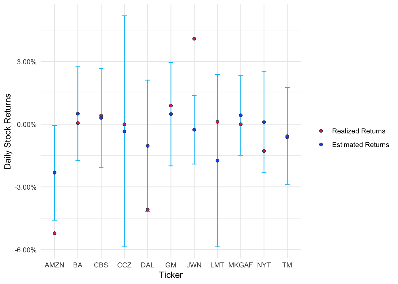
Figure 7.2: Stock Reactions to Trump Attacks
Interestingly, except for Amazon, no other stock suffered from Trump attack! Nordstrom actually showed an unexpected increase in the stock price. Otherwise, rest 9 stocks have no effect of Trump Twitter attack.